For some businesses, accessibility is a requirement, for some it’s not, but one thing has been made strikingly clear in recent years: digital accessibility standards are best practices for everyone. They are really human standards. And yet they are often ignored or overlooked once digital projects get going because in most cases there isn’t a sole person responsible for ensuring it gets done. So until we all have a CAE (Chief Accessibility Expert), we’ll have to find ways to each take responsibility.
That’s where we can help.
What is digital accessibility?
Most of the time when people think about accessibility on the web they assume it’s mostly about visual disabilities, but in fact digital accessibility includes support for visual, mobility, cognitive, and auditory issues. Don’t stop at considering solutions for blind customers – there are many people who use the web in different ways.
Digital accessibility means that people living with visual, mobility, cognitive, and auditory conditions can access web, software, and mobile applications.
There are myriad reasons to pay attention to digital accessibility (and, hey, you’re here, so you’re probably already convinced it’s a good idea!), but often the most compelling reason is the business reason: 20% of people have some kind of impairment that affects the way they interact with and understand digital products. That means that 20% of your customers or audience are affected, too. Creating digitally accessible products means you’re connecting with your entire customer base and minimizing risk. Plus, Google search likes it, too! It’s a win-win.
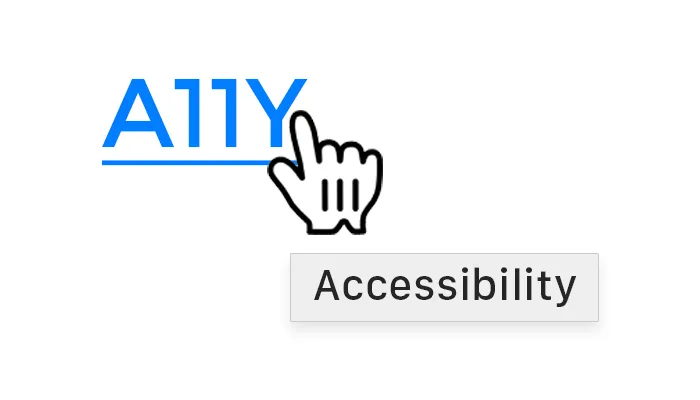
Terminology Tip: Accessibility is often shortened to a11y (eleven representing the eleven letters between ‘a’ and ‘y’ in the word). It’s faster and easier to type.
So, how can you integrate digital accessibility standards into projects, whether you’re a client, technologist, or project manager?
Familiarize yourself with W3C (and ask your digital partner to, as well).
Don’t assume that someone else will know all the details. The World Wide Web Consortium (W3C) is an international community where member organizations, a full-time staff, and the public work together to develop web standards. While their mission covers more than accessibility, they are leading the charge when it comes to the topic.
When you start a project, introduce the W3C standards as a baseline for what accessibility standards you will adopt. If you can’t go for the full recommended list, create your own list of standards that you and your team will follow. If you’re a client, bring it up in your RFP or initial pitch processes to see if your prospective partners are equipped to handle the requirements. If you’re on the practitioner side, add it to the SOW or the pitch deck. No matter what your role, bring it up early and often.
A11y Tip: Form timeouts (forms that cancel or refresh after a certain amount of time, deleting all data that’s been entered) cause considerable issues for people who don’t use traditional keyboards or mouse setups.
Create a user persona (or three) with a disability.
A point that can’t be underscored too frequently is that digital accessibility isn’t just helpful for people with legal disabilities. Baby Boomers are an example of a demographic served very well by an a11y approach, and it’s also one to which almost everyone has a personal connection (parents, grandparents, or other community members). Vision and mobility issues are setting in within that generation at the same time that they are becoming increasingly dependent on and familiar with digital technologies.
No better reason to add some visual, mobility, cognitive, and auditory conditions to your user personas. User personas are core to every part of your business operations: they should influence decisions about products, services, marketing, and advertising. By adding in details about various impairments or conditions, you and the team are more likely to empathize and integrate those real-life issues into your work.
A11y Tip: Some visible aspects of a11y include color, contrast, link styles, animations, motion, CAPTCHA entry, and text saved into graphic images.
Simulate experiences that your impaired users will have.
Nothing changes minds and hearts more than standing in someone else’s shoes. Experiencing a screen reader in action or purchasing eye glasses than simulate visual impairment are pivot experiences.
Make sure it’s written into product testing and the QA processes.
You brought up a11y requirements early, your team and partners got on board, and you designed and developed accordingly, now it’s time to ensure that those efforts were successful. To do that, you have to make sure that the Software Testing and Quality Assurance processes are set up to test each detail.
This tool, Wave: Web Accessibility Evaluation Tool, can help with cursory evaluations, but professional testers should take a more comprehensive approach. The W3C has a list of web accessibility evaluation tools. For team clarity, each a11y requirement should be listed specifically and individually in the test plan.
A11y Tip: Invisible aspects of a11y include meta tags, headline hierarchy and HTML structure, ARIA tags, alt text, and keyboard navigation.
Do user testing before launch.
User testing sounds elaborate and expensive, but that’s not always the case. It does take effort, though. By putting your product, website, or app in the hands of users – in this case ones who rely on digital accessibility practices – you can get immediate and personal feedback that often cuts straight to the point in a way that test scenarios can’t simulate.
If you’re interested in learning more about web accessibility, we created a checklist that outlines some top level considerations to take into account throughout the lifecycle of a project. And it’s free!


