Allow me to paint you a picture of every designer’s greatest fear. You’ve just finished presenting a design to the client. For the last month you’ve toiled away, pouring your heart and soul into this design, and it’s the moment of truth. The client looks at you and says, “I don’t like it.”
Design is subjective, and there is always potential that someone may not like something you’ve done. But the way to combat that isn’t by protecting your design and keeping to yourself. Instead it’s by involving your client early and often.
Where the Magic Happens
Showing in-progress work to a client can feel counterintuitive, and it’s different than the way a lot of agencies do it. The traditional agency approach is to work behind the scenes and then unveil the creative in a big ta-da moment. You watch a show like MadMen and it’s easy to think that this unveiling is when the magic happens.
I recently watched a short documentary on Craig Frazier, a successful designer who shifted focus towards illustration in the 90s. In it, he explains his process for coming up with ideas, and says, “If there’s anything magical about illustrations, it happens at the sketch stage.” Replace the word “illustration” with “interactive design” and you have the basis for our design philosophy at Clockwork.
Our Process
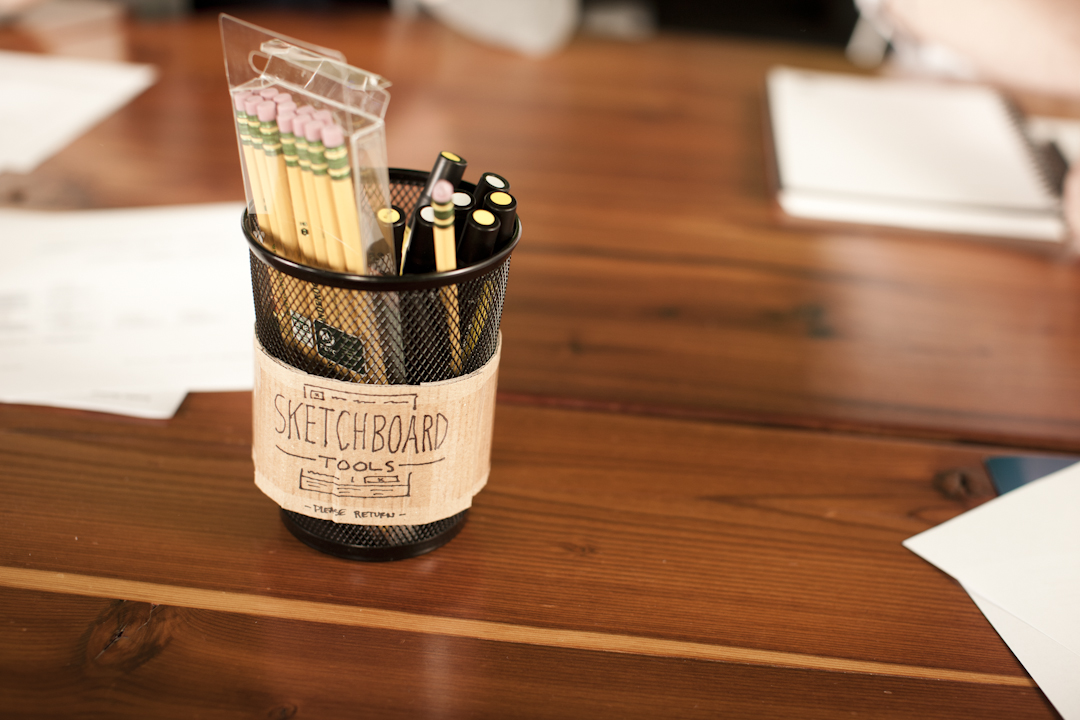
At Clockwork we’ve spent years perfecting our process and we rely heavily on pencil and paper before ever jumping onto the computer. This might seem odd given that we’re a digital agency, but a lo-fi approach is an accessible, quick way to get clients thinking about look, feel, and sometimes even functionality. We’ve found that by involving our clients in certain brainstorm and sketching activities — basically, “unfinished” work — we generate better ideas and they become a part of the magic. As the project evolves, the interactive parts of the end product, like navigation, buttons, templates, and more, have context. And, of course, we greatly reduce the chances of getting all the way to the end of a project only to hear, “I don’t like it.”
Here are just a few of the activities that we’ve found to be extremely effective:
Brainstorming – Early in the process we often facilitate brainstorm sessions to generate ideas. Most of us are familiar with brainstorming exercises, and know that they can be useful opportunities for stakeholders and team members to hear initial ideas. (Toni recently wrote a great post outlining some guidelines for a successful brainstorm.) In addition to idea-sharing and team-building, brainstorms will often give you a sense of potential discrepancies or gaps that will need to be worked through. For example, if one stakeholder thinks that an app’s primary function is sales, and another thinks it’s inventory management, that’s great information to have upfront.
Sketchboarding – We’ve found sketchboarding to be a great way to work with clients on user-interface design projects. We begin by reviewing the client’s content hierarchy (typically in the form of a Page Description Diagram, that documents page content components and priorities without specifying layout) and then launch into iterative rounds of sketching. With these exercises, we begin to form the basic page layouts with general content areas and high-level functionality. (For a specific example, check out this blog post on sketchboarding for Tours Abroad.) These sketches are a great segue, or complement, to wireframes and requirements and help crystallize for both clients and project teams how screens will look (for example, “header here” and “submenu here”).
Concept Sketches – With wireframes in place, we often use concept sketches to quickly explore different creative layouts of a page. At this point, we’re looking to confirm that we get the look and feel right. As I said above, design is subjective, so direction like “clean and fresh” or “bold” can mean different things to different people. We’ve found that showing these to clients will get necessary buy-in and help us avoid going down the wrong path.
What’s So Great About Sketching?
When you hear someone explain an idea, there is a lot left open for interpretation. However, when you sketch something out with pencil and paper it ensures that you’re on the same page (literally). You can point to a specific part of the idea and get clarification. More importantly, studies have shown that sketches stimulate creativity and allow others to re-interpret and build on existing ideas.
“In idea generation groups, sketches can stimulate creativity by providing new directions for idea generation in an individual generate-interpret cycle. And, sketches can provide a more integrated group process, by providing better access to the earlier ideas, especially in the shared parts of external memory.”
Remko van der Lugt, Design Professor and researcher
Dr. van der Lugt’s full study can be found here and it offers insights into sketching in different types of idea-generation meetings.
Conclusion
With all the technology we have at our fingertips, sometimes sketching is still one of the best ways to bring teams, opinions, and ideas to life. Design is more than pretty colors and appealing fonts. It’s a process that makes things usable and effective. And it does so by making products — whether it’s a coffee maker or an app — intuitive and clear. Sketches get us, as interactive teams, far along so when we turn to technology, we’re confident and efficient, and successfully avoid the dreaded, “We don’t like it.”


