This website uses cookies so that we can provide you with the best user experience possible. Cookie information is stored in your browser and performs functions such as recognising you when you return to our website and helping our team to understand which sections of the website you find most interesting and useful.
Category: How we work
-
Technology isn’t forever, but your digital partnership can be

(featured image: Me wearing Google Glass, a much-hyped but now defunct technology.) Last year, we made the decision to discontinue the Active Media Manager (AMM), our proprietary CMS that we have been developing for over 15 years. By February 2019, we will be terminating the platform altogether. A number of clients are currently using the…
-
eyebobs and Clockwork partner on Website Redesign

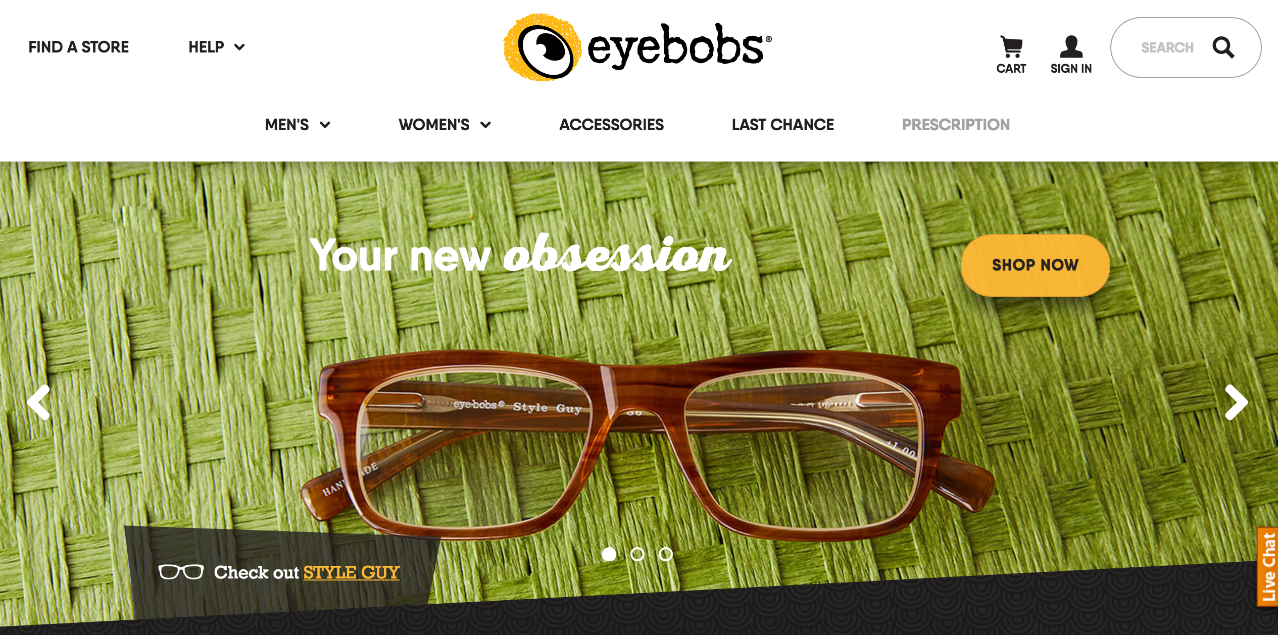
eyebobs, the national eyeglass maker based in the Twin Cities, launched a redesigned website on July 12th. The new direct sales site showcases the brand’s whimsical personality, allows the company to tell their story, and has a smooth and simple customer experience. The new website was a collaboration between eyebobs, Clockwork, Rocket Web, and Ideas…
-
Right-sized Learning-Management Tools for Flexible, Affordable Field Education
No matter what business you’re in, chances are you have education, training, or learning objectives to meet. Some of these objectives, such as highly complex technical learning or certification requirements, call for a significant learning-management tool or system (LMS). But for many, if not most, learning needs, you simply need to convey some new information…
-
Clockwork Redesigns Ramsey County Website

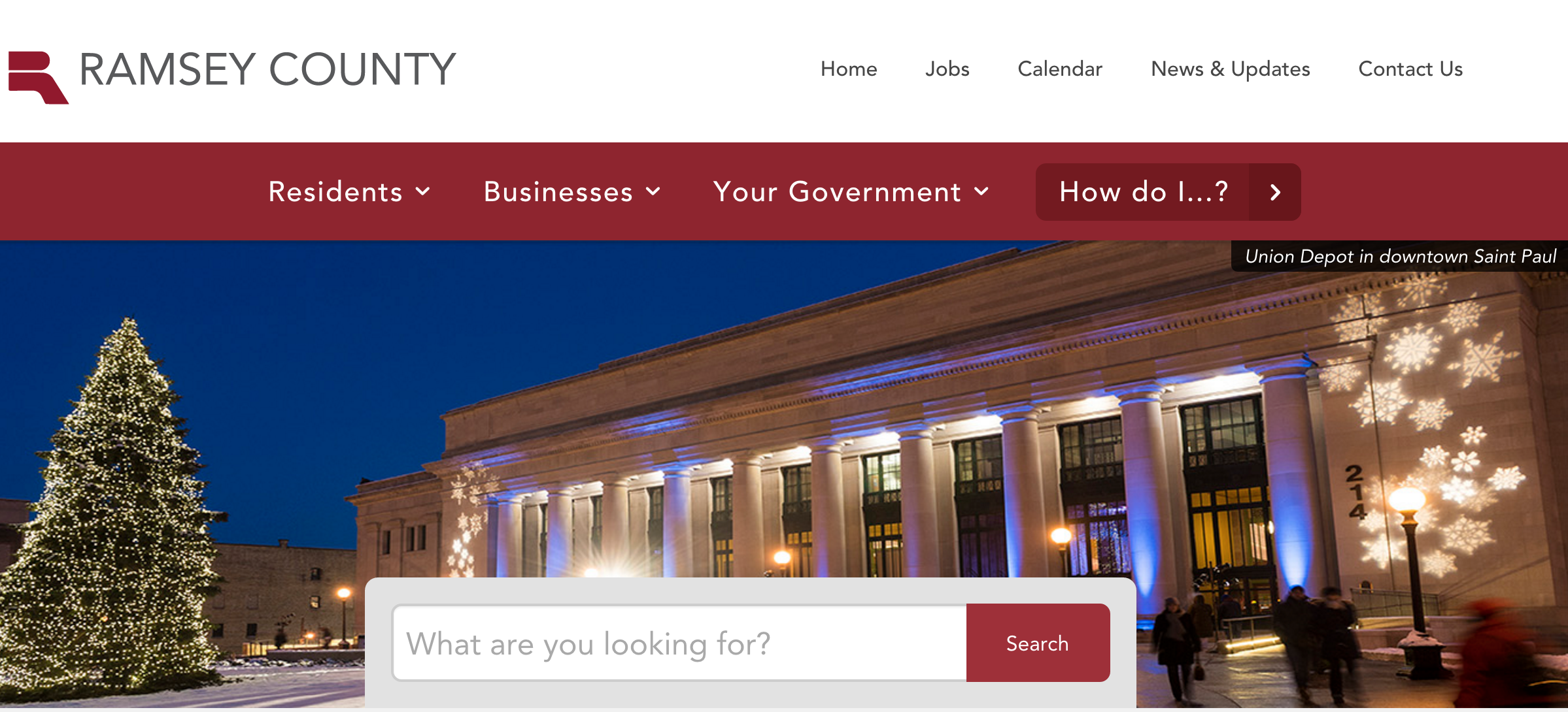
Ramsey County wanted to centralize and streamline digital access to County information and transactions for their audiences. And, over the course of our 18-month partnership, that’s exactly what we collaboratively achieved. We started with an information portal and transformed their website into a hub of active service delivery and community engagement. Project Strategy: Focus on Users, Current…
-
Youthprise Website Launch
Clockwork and Youthprise recently partnered on a website redesign to connect better with Youthprise’s multiple audiences and to tell their story more effectively. The organization does amazing, complex work and they wanted to amplify the breadth and depth of what they do. Founded by the McKnight Foundation in 2010, Youthprise’s mission is to champion learning beyond…
-
Doomtree All Hands Launch

In collaboration with Minneapolis-based indie hip hop collective and record label Doomtree, we created a promotion that activated fans, increased engagement, and ultimately wowed users. The content was entertaining and the experience was seamless — making for an ideal campaign. The site and UX were nominated for site of the day on CSS Awards and…
-
Park Tool Launch

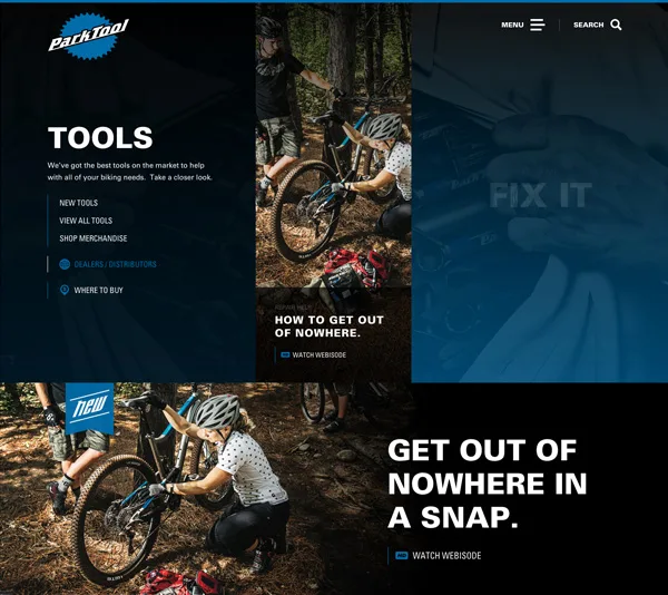
As the largest bike tool manufacturer in the world, Park Tool needed a website upgrade that matched their world-class status. The company is known for their quality, innovation, and superb customer service and we built a responsive, intuitive site that hit home with their loyal, active audience. For Clockwork, the project was a natural fit.…
-
Clockwork Launches New Website for Nation’s #1 Park System
The Nation’s #1 Park system, the Minneapolis Park & Recreation Board (MPRB), launched a new responsive website to better serve the Twin Cities community. Offering everything from activity sign-up to golf to wedding venues, the MPRB website receives more than 2.2 million visitors each year. The new website elevates users’ MPRB digital experience, and will serve as an…
-
Getting Rid of the Big Ta-da: Why We Love Sketching

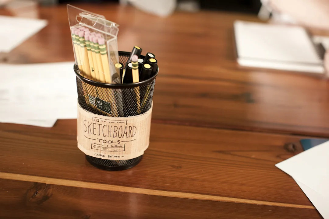
Allow me to paint you a picture of every designer’s greatest fear. You’ve just finished presenting a design to the client. For the last month you’ve toiled away, pouring your heart and soul into this design, and it’s the moment of truth. The client looks at you and says, “I don’t like it.” Design is…
-
Why research and planning matters
Clients come to us asking for an app, a promotion, an intranet redesign, a lifecycle management tool. This is a great starting place, but it’s starting with the solution instead of the problem. Before we start building anything, we want to understand what’s driving the need, what problem we need to solve, or what business…
