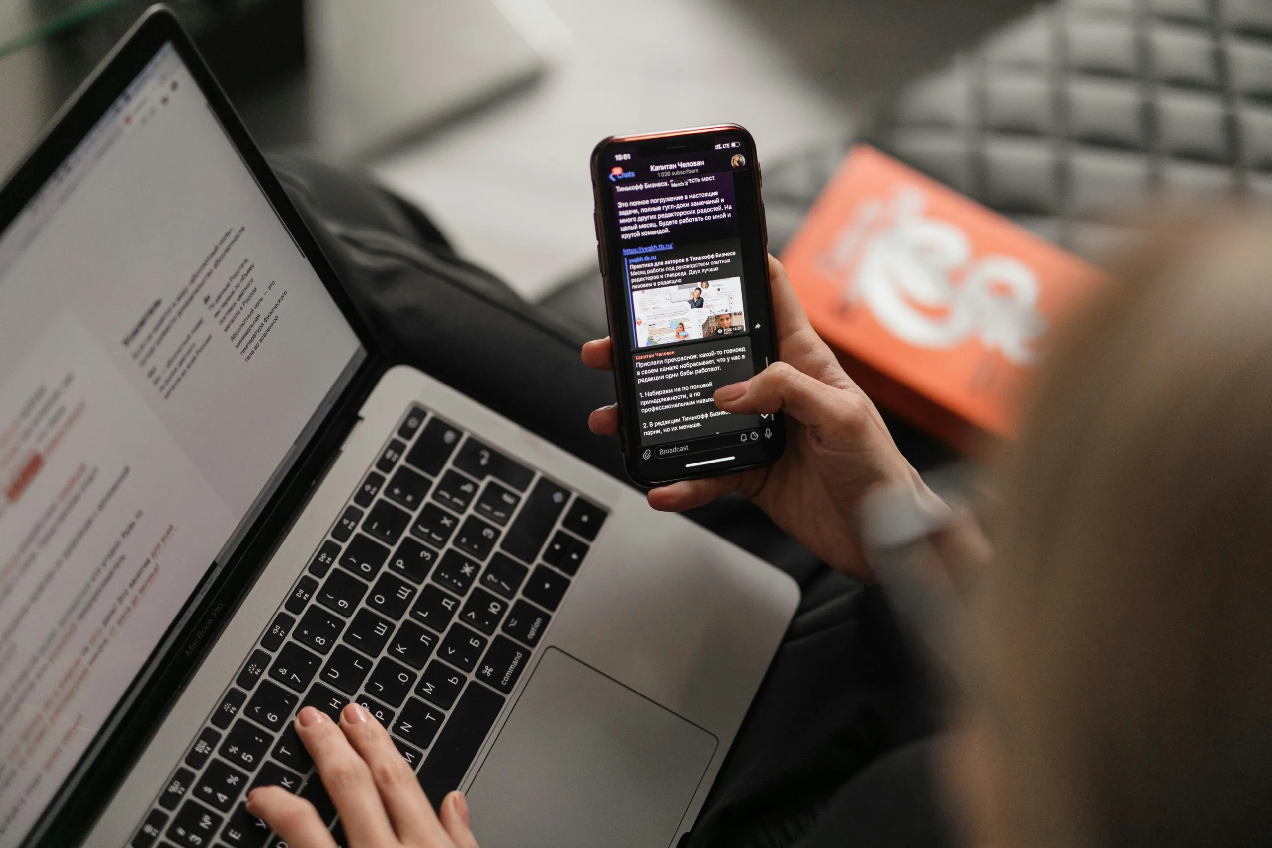
Imagine this scenario: You’re in line at the store, reading through news items on your phone. You’re interested in more detail on a story, so you do a quick Google search to get more information. After finding a reputable source, you tap on the link, see a few sentences, but then you are immediately blocked by a gray interstitial (pop-up) that takes over your entire screen.
“Where is that x?” you think. “How can I get rid of this thing?” There’s no obvious button that will help you move along and get the information you need. Disappointed, you give up on the site.
This is an increasingly common use case as content providers look to monetize content and services. These interruptive moments to “Sign-up for our promotion!” or “Get 20% off if you sign up for our newsletter!” rarely (if ever) serve the end users. Sometimes they may be able to get a hint of the content before being presented with the pop-ups, but oftentimes not.
Google has noticed this practice and thinks it’s getting in the way of user experience, especially on mobile devices. They’ve announced that sites using these types interstitials might suffer in search rankings. Their new weighting won’t cover sites that use these for legal reasons, to get users to log in, or use “reasonable” space.
Many companies will start to look to alternatives to this methodology: they want to find a way to put promotional items in front of users without jeopardizing experience or ranking. Maybe you do. So, what are some alternatives?
Use Google’s Size Recommendations
Take a look at Google’s “reasonable” size recommendations. Remember, this new ranking is all for the sake of mobile. Pay attention to the size and make it easily dismissible.
Use the Content to Engage
Instead of forcing users to subscribe in order to view content, prompt users to subscribe contextually as they are engaging with the content. Forcing users to sign up leads to abandonment or users who aren’t engaged in the first place.
Put Things on Delay
Instead of giving users a coupon immediately, display it after they’ve been browsing for 5 minutes. If they’re still looking, they like what they see and perhaps that offer can help move the needle. Give them time to know if they want to continue.
Try Something New
The core principle of these practices is stopping your users; when you do that, you prevent engagement and increase frustration. It’s kind of like saying to someone after they’ve ordered a muffin, “Oh I see you’re getting a blueberry muffin, before you enjoy the warm deliciousness, you have to listen to the back story of how that muffin was made.”
The person probably won’t want to wait around for that muffin and they’ll have a bad taste in their mouth. Think about ways you can keep users engaging with content and recognizing value while reminding them of the benefits of the product.
In all of this, it’s important to remember that the users who like and find your site valuable will return and will engage. Getting a 10x increase in sign ups just because they couldn’t easily bypass the popup on their phone does not actually increase revenue. Dedicated groups of users who care and engage does. Don’t alienate those that love you or those that could, be creative and show your value.


